Visual 총정 1
이번 기초대회를 통해 데이터 분석의 중요성을 느꼈다.
그리고 이를 위한 가장 critical 한 방법이 시각화라는 것을 느껴, Data Visualization 을 다시 공부하려 한다.
처음부터 다시 정리해 가겠다.
Matplotlib
- 그래프 그리기
figure 라는 큰 틀에 ax라는 서브플롯을 추가해서 만든다.
fig = plt.figure()

ax1 = fig.add_subplot(121)
ax2 = fig.add_subplot(122)

plt.show()
한번에 할 때는
fig, axes = plt.subplots(1,2, figsize= (12,7))
- 한 서브플롯에서 여러개 그리기
그냥 ax위에 여러번 그리면 됨
fig = plt.figure()
ax = fig.add_subplot(111)

ax.plot([1,2,3,],[1,2,3])
ax.bar([1,2,3,],[1,2,3])
- 색상, 텍스트 사용
그래프 코드 안에 color
fig = plt.figure()
ax = fig.subplot(111)

ax.plot([1,2,3], color = 'green')
코드 안에 label
legend, title은 따로 설정하는 코드
fig = plt.figure()
ax= fig.subplot(111)

ax.plot([1,2,3], label = '1')

ax.legend()
ax.set_title("basic plot")
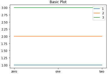
- 축 축은 ticks 와 ticklabels 로 구분
fig = plt.figure()

ax = fig.subplot(111)

ax.plot([1,1,1],label='1')

ax.set_xticks([0,1,2])
ax.set_xticklabels(['zero','one','two'])
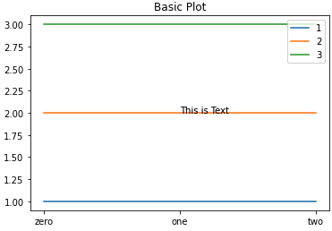
- 그래프 위에 텍스트 추가
1) ax. text
ax.text(x=1, y=2, s = 'This is Text')
2) ax. annotate
화살표 추가할 수 있다는 장점
ax.annotate(s = 'This is Text', xy=(1,2),
		   xytext = (1.2,2.2),
		   arrowprops = dict(facecolor = 'black'))
Barplot
- bar 수직 / barh 수평
fig, axes = plt.subplots(1,2, figsize= (12,7))

x = list('ABCDE')
y = np.array[1,2,3,4,5]

axes[0].bar(x,y)
axes[1].barh(x,y)

plt.show
- y축 범위 공유
1) sharey 파라미터 사용
fig, axes = plt.subplots(1,2, figsize=(15,7), sharey = True)
axes[0].bar(group['male'].index, group['male'], color='royalblue')

axes[1].bar(group['female'].index, group['female'], color='tomato')

plt.show()
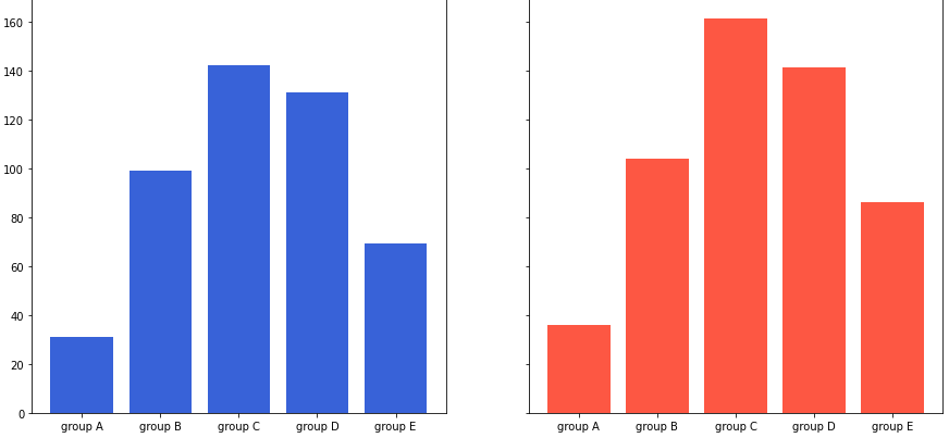
2) 개별적 조정
for ax in axes:
	ax.set_ylim = (0,200)
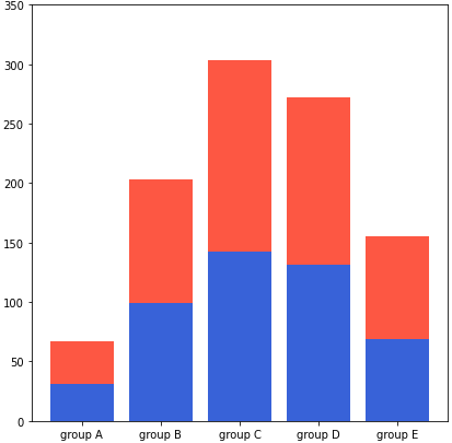
- Stacked Bar plot
bottom 파라미터 -> 아래 공간을 비워두기
(barh 에서는 left)
axes[1].bar(group['male'].index, group['male'], color = 'blue')

axes[1].bar(group['female'].index, group['female'], color = 'red', bottom = group['male'])

axes[1].set_ylim(0,350)
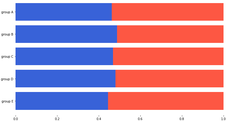
- percentage stacked bar plot
이를 이용하여 percentage 그래프를 만들 수 있다.
total=group['male']+group['female'] # 각 그룹별 합

ax.barh(group['male'].index, group['male']/total, color='royalblue')

ax.barh(group['female'].index, group['female']/total, left=group['male']/total, color='tomato')
- 겹쳐서 그리기
-> 투명도 사용 : alpha
axes[0].bar(group['male'].index, group['male'], color = 'blue', alpha = 0.3)

axes[0].bar(group['female'].index, group['female'], color = 'red', alpha = 0.5)
- Grouped bar plot
그래프 인덱스 조정해서 여러개 생성
- x축 조정
width조정xticks,xticklabels
fig, ax = plt.subplots(1,1, figsize =(12, 7) )

idx = np.arange(len(group['male'].index))
width = 0.35

ax.bar(idx-width/2 , group['male'], width = width)

ax.bar(idx+width/2 , group['female'], width = width)
댓글남기기