Visual.2-1 Barplot 사용하기
1. Bar plot 사용하기
bar plot : 막대 그래프 / 차트
ㄴ category에 따른 수치값을 비교하기에 적합한 방법
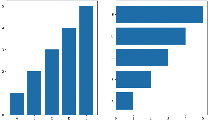
막대 방향에 따른 분류 .bar() : 수직방향, .barh() : 수평방향
아래 내용 모두 그룹이 5~7개 이하일 때 효과적
그룹이 많다면 top 5같이 하고 나머지는 etc로 처리.
multiple bar plot
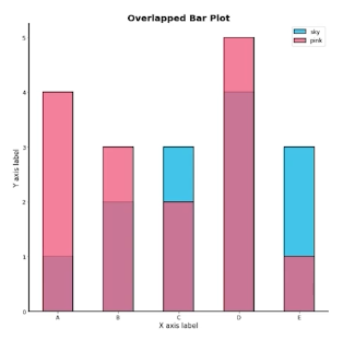
Stacked Bar plot
2개 이상의 그룹을 쌓아서 표현
-> 전체적인 분포, 맨 밑의 bar 분포만 파악하기 쉬움
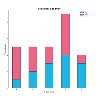
.bar() 에서는 bottom 파라미터 사용
.barh()에서는 left 파라미터 사용
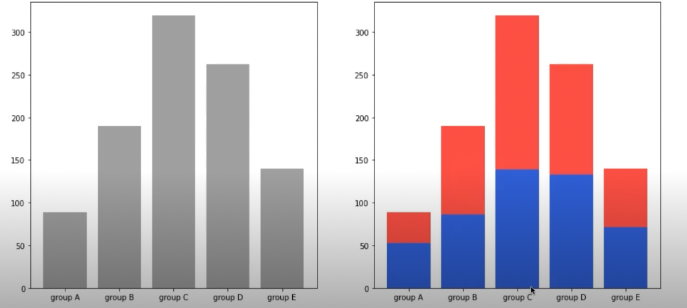
fig, axes = plt.subplots(1, 2, figsize=(15, 7))

group_cnt = student['race/ethnicity'].value_counts().sort_index()
axes[0].bar(group_cnt.index, group_cnt, color='darkgray')
axes[1].bar(group['male'].index, group['male'], color='royalblue')
axes[1].bar(group['female'].index, group['female'], bottom=group['male'], color='tomato')

for ax in axes:
    ax.set_ylim(0, 350)

plt.show()
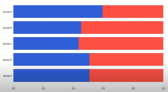
Percentage Stacked Bar chart
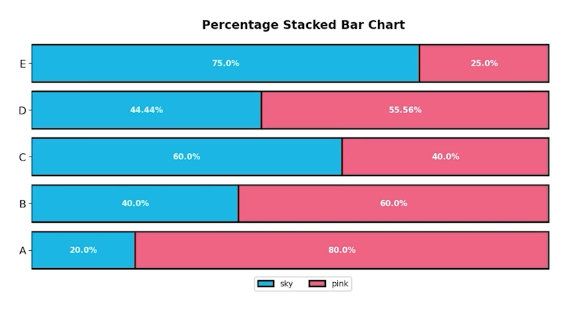
fig, ax = plt.subplots(1, 1, figsize=(12, 7))

group = group.sort_index(ascending=False) # 역순 정렬
total=group['male']+group['female'] # 각 그룹별 합


ax.barh(group['male'].index, group['male']/total,
        color='royalblue')

ax.barh(group['female'].index, group['female']/total,
        left=group['male']/total,
        color='tomato')

ax.set_xlim(0, 1)
for s in ['top', 'bottom', 'left', 'right']:
    ax.spines[s].set_visible(False) #테두리 없애기

plt.show()
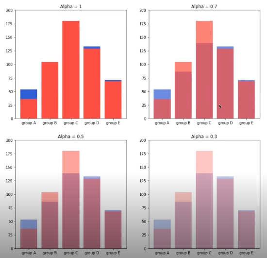
Overlapped Bar Plot
겹쳐서 만드는 것
투명도 : alpha
group = group.sort_index() # 다시 정렬

fig, axes = plt.subplots(2, 2, figsize=(12, 12))
axes = axes.flatten()

for idx, alpha in enumerate([1, 0.7, 0.5, 0.3]):
    axes[idx].bar(group['male'].index, group['male'],
                  color='royalblue',
                  alpha=alpha)
    axes[idx].bar(group['female'].index, group['female'],
                  color='tomato',
                  alpha=alpha)
    axes[idx].set_title(f'Alpha = {alpha}')

for ax in axes:
    ax.set_ylim(0, 200)


plt.show()
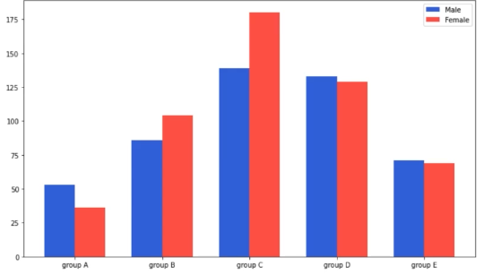
Grouped Bar Plot
가장 추천하는 방법 그룹별 범주에 따른 bar를 이웃되게 배치하는 방법
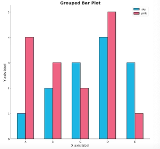
Matplotlib에서는 구현 까다로움 (seaborn에서 보다 쉬움)
크게 3가지 테크닉으로 구현 가능합니다.
- x축 조정
width조정xticks,xticklabels
원래 x축이 0, 1, 2, 3로 시작한다면 - 한 그래프는 0-width/2, 1-width/2, 2-width/2 로 구성하면 되고 - 한 그래프는 0+width/2, 1+width/2, 2+width/2 로 구성하면 됩니다.
fig, ax = plt.subplots(1, 1, figsize=(12, 7))

idx = np.arange(len(group['male'].index))
width=0.35

ax.bar(idx-width/2, group['male'],
       color='royalblue',
       width=width, label='Male')

ax.bar(idx+width/2, group['female'],
       color='tomato',
       width=width, label='Female')

ax.set_xticks(idx)
ax.set_xticklabels(group['male'].index)
ax.legend()

plt.show()
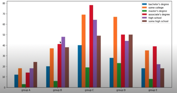
그룹이 N개 일때 index i(zero-index)에 대해서는 다음과 같이 x좌표를 계산할 수 있다. $x+\frac{-N+1+2\times i}{2}\times width$
group = student.groupby('parental level of education')['race/ethnicity'].value_counts().sort_index()
group_list = sorted(student['race/ethnicity'].unique())
edu_lv = student['parental level of education'].unique()


fig, ax = plt.subplots(1, 1, figsize=(13, 7))

x = np.arange(len(group_list))
width=0.12

for idx, g in enumerate(edu_lv):
    ax.bar(x+(-len(edu_lv)+1+2*idx)*width/2, group[g],
       width=width, label=g)

ax.set_xticks(x)
ax.set_xticklabels(group_list)
ax.legend()

plt.show()
 나중엔 seaborn countplot으로 가능
정확한 Bar plot
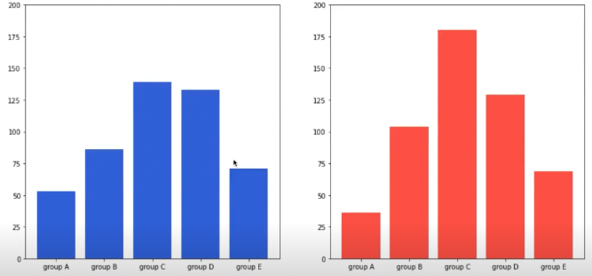
principle of proportion Ink
- 실제 값과 그에 표현되는 그래픽으로 나타나는 잉크의 수는 같아야함
- 축은 x축(0) 으로 잡아야 정확한 비교 가능해짐
->
sharey파라미터를 사용하는 방법 -> y축 범위를 개별적으로 정해서 통일시키는 방법for ax in axes: ax.set_ylim(0, 200)
데이터 정렬
pandas 에서는 sort_values() , sort_index()로
여러가지 기준으로 정렬하면서 패턴을 발견 대시보드에서는 interactive 제공하는 것이 유용
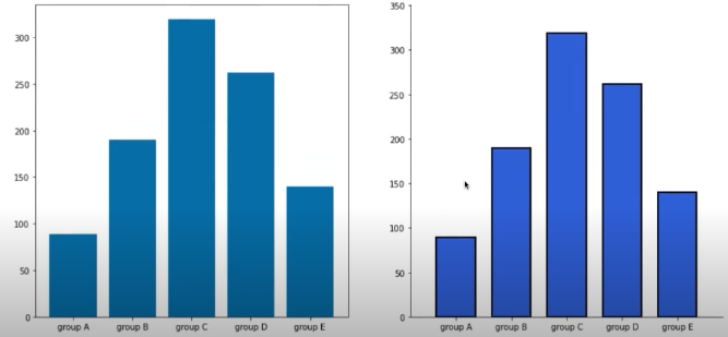
적절한 공간 활용
: 여백과 공간만 조정해도 가독성이 높아진다.
- X/Y axis Limit (
.set_xlim(),.set_ylime()) - Margins (
.margins()) : 양 옆 공간 (초기값 0.05) - Gap (
width) - Spines (
.spines[spine].set_visible()) : 테두리 없애기
group_cnt = student['race/ethnicity'].value_counts().sort_index()

fig = plt.figure(figsize=(15, 7))

ax_basic = fig.add_subplot(1, 2, 1)
ax = fig.add_subplot(1, 2, 2)

ax_basic.bar(group_cnt.index, group_cnt)
ax.bar(group_cnt.index, group_cnt,
       width=0.7,
       edgecolor='black',
       linewidth=2,
       color='royalblue'
      )

ax.margins(0.1, 0.1)

for s in ['top', 'right']:
    ax.spines[s].set_visible(False)

plt.show()
축과 디테일 등의 복잡함
복잡함이 멋있어 보일 수 있지만
정보 전달 , 데이터 분석에서는 역효과가 날 수 있다.
Grid : .grid()
Ticklabels : .set_ticklabels()
text : .text(), .annotate()
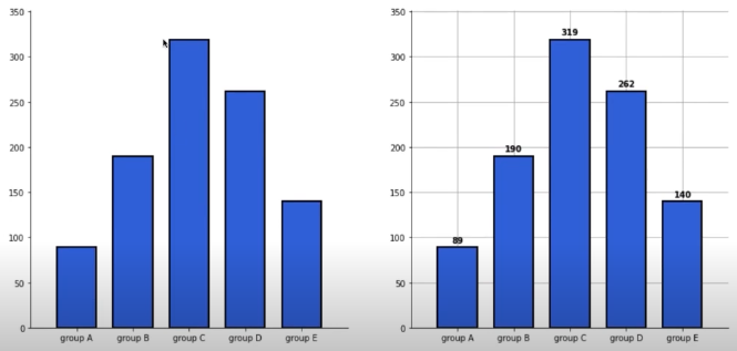
그리드, 텍스트 추가
group_cnt = student['race/ethnicity'].value_counts().sort_index()

fig, axes = plt.subplots(1, 2, figsize=(15, 7))

for ax in axes:
    ax.bar(group_cnt.index, group_cnt,
           width=0.7,
           edgecolor='black',
           linewidth=2,
           color='royalblue',
           zorder=10
          )

    ax.margins(0.1, 0.1)

    for s in ['top', 'right']:
        ax.spines[s].set_visible(False)

axes[1].grid(zorder=0)

for idx, value in zip(group_cnt.index, group_cnt):
    axes[1].text(idx, value+5, s=value,
                 ha='center',
                 fontweight='bold'
                )

plt.show()
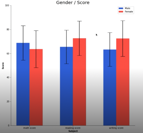
- 이외
오차 막대를 추가하여 uncertainty 정보 추가 가능 (errorbar)
bar 사이 거리 0으로 하고자 하면 -> histogram (hist())
다양한 text 정보 활용하기 -> 제목(.set_title()), 라벨 (.set_xlabel(), set.ylabel())
fig, ax = plt.subplots(1, 1, figsize=(10, 10))

idx = np.arange(len(score.index))
width=0.3


ax.bar(idx-width/2, score['male'],
       color='royalblue',
       width=width,
       label='Male',
       yerr=score_var['male'],
       capsize=10
      )

ax.bar(idx+width/2, score['female'],
       color='tomato',
       width=width,
       label='Female',
       yerr=score_var['female'],
       capsize=10
      )

ax.set_xticks(idx)
ax.set_xticklabels(score.index)
ax.set_ylim(0, 100)
ax.spines['top'].set_visible(False)
ax.spines['right'].set_visible(False)

ax.legend()
ax.set_title('Gender / Score', fontsize=20)
ax.set_xlabel('Subject', fontweight='bold')
ax.set_ylabel('Score', fontweight='bold')

plt.show()
댓글남기기