Visual.2-2 Lineplot 사용하기
2. Line plot 사용하기
Line plot : 꺾은선 그래프
.plot() 함수 사용
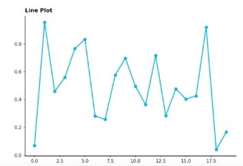
선을 구별하는 요소
- 색(color)
- 마커(marker) : 마커의 종류
- 선의 종류(linestyle) :
solid,dashed,dashdot,dotted,None,
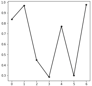
fig, ax = plt.subplots(1, 1, figsize=(5, 5))

np.random.seed(97)
x = np.arange(7)
y = np.random.rand(7)

ax.plot(x, y,
        color='black',
        marker='*',
        linestyle='solid',
       )

plt.show()
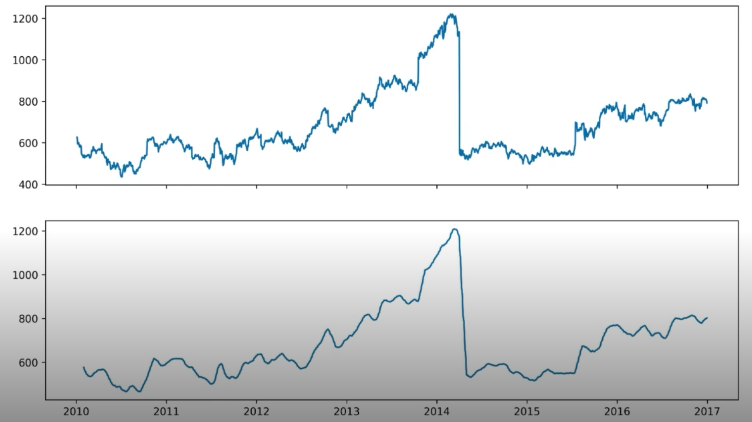
시시각각 변동하는 데이터는 패턴 파악 어려움 -> Noise 방해 줄이기 위해 smoothing 사용.
이동평균 사용(rolling)
google_rolling = google.rolling(window=20).mean()

fig, axes = plt.subplots(2, 1, figsize=(12, 7), dpi=300, sharex=True)

axes[0].plot(google.index,google['close'])
axes[1].plot(google_rolling.index,google_rolling['close'])

plt.show()
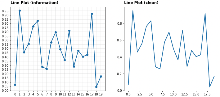
정확한 Lineplot
추세에 집중
- 꼭 축을 0에 초점을 둘 필요 x
- clean 하게 나타낸 plot 이 더 깔끔하게 보일 수 있음
간격
- 규칙적인 간격으로 하고,
- 없는 데이터를 표현하기 위해서 마커를 사용
보간
: interpolation presentation에는 좋은 방법일 수 있으나 일반적인 분석에선 지양할 것.
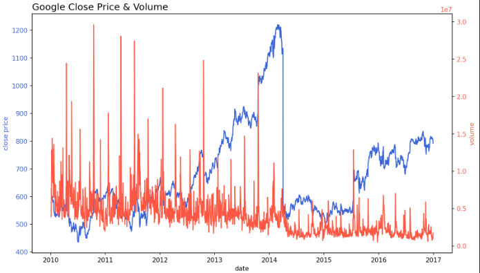
이중 축 사용
한 Plot 에 대해 2개의 축
- 축 2개 :
.twinx()```python fig, ax1 = plt.subplots(figsize=(12, 7), dpi=150)
First Plot
color = ‘royalblue’
ax1.plot(google.index, google[‘close’], color=color)
ax1.set_xlabel(‘date’)
ax1.set_ylabel(‘close price’, color=color)
ax1.tick_params(axis=’y’, labelcolor=color)
# Second Plot
ax2 = ax1.twinx()
color = ‘tomato’
ax2.plot(google.index, google[‘volume’], color=color)
ax2.set_ylabel(‘volume’, color=color)
ax2.tick_params(axis=’y’, labelcolor=color)
ax1.set_title(‘Google Close Price & Volume’, loc=’left’, fontsize=15) plt.show()
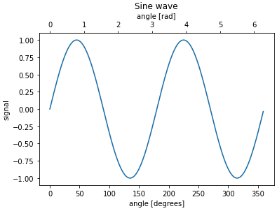
+ 한 데이터, 다른 단위 : `.secondary_xaxis()` , `.secondary_yaxis()`
```python
def deg2rad(x):
return x * np.pi / 180
def rad2deg(x):
return x * 180 / np.pi
fig, ax = plt.subplots()
x = np.arange(0, 360)
y = np.sin(2 * x * np.pi / 180)
ax.plot(x, y)
ax.set_xlabel('angle [degrees]')
ax.set_ylabel('signal')
ax.set_title('Sine wave')
secax = ax.secondary_xaxis('top', functions=(deg2rad, rad2deg))
secax.set_xlabel('angle [rad]')
plt.show()
ETC
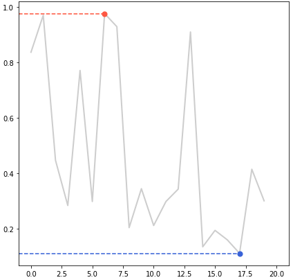
- 범례 대신 라인 끝 단에 레이블을 추가하면 식별에 도움
- min, max 정보 추가해 주면 도움 될 수 있음
- 보다 연한 색을 사용하여 uncertainty 표현 가능 (신뢰구간, 분산 등)
최대최소 코드
fig = plt.figure(figsize=(7, 7))

np.random.seed(97)

x = np.arange(20)
y = np.random.rand(20)

ax = fig.add_subplot(111)
ax.plot(x, y,
       color='lightgray',
       linewidth=2,)

ax.set_xlim(-1, 21)

# max
ax.plot([-1, x[np.argmax(y)]], [np.max(y)]*2,
        linestyle='--', color='tomato'
       )

ax.scatter(x[np.argmax(y)], np.max(y),
            c='tomato',s=50, zorder=20)

# min
ax.plot([-1, x[np.argmin(y)]], [np.min(y)]*2,
        linestyle='--', color='royalblue'
       )
ax.scatter(x[np.argmin(y)], np.min(y),
            c='royalblue',s=50, zorder=20)

plt.show()
댓글남기기